Losses#
This notebook explores linear models and loss functions in depth. We use the previous regression problem that models the relationship between penguins’ flipper length and body mass.
# When using JupyterLite, you will need to uncomment and install the `skrub` package.
%pip install skrub
import matplotlib.pyplot as plt
import skrub

skrub.patch_display()  # make nice display for pandas tables
/home/runner/work/traces-sklearn/traces-sklearn/.pixi/envs/docs/bin/python: No module named pip
Note: you may need to restart the kernel to use updated packages.
import pandas as pd

data = pd.read_csv("../datasets/penguins_regression.csv")
data
Processing column 1 / 2
Processing column 2 / 2
| Flipper Length (mm) | Body Mass (g) | |
|---|---|---|
| 0 | 181.0 | 3750.0 |
| 1 | 186.0 | 3800.0 |
| 2 | 195.0 | 3250.0 |
| 3 | 193.0 | 3450.0 |
| 4 | 190.0 | 3650.0 |
| 337 | 207.0 | 4000.0 |
| 338 | 202.0 | 3400.0 |
| 339 | 193.0 | 3775.0 |
| 340 | 210.0 | 4100.0 |
| 341 | 198.0 | 3775.0 |
Flipper Length (mm)
Float64DType- Null values
- 0 (0.0%)
- Unique values
- 55 (16.1%)
- Mean ± Std
- 201. ± 14.1
- Median ± IQR
- 197. ± 23.0
- Min | Max
- 172. | 231.
Body Mass (g)
Float64DType- Null values
- 0 (0.0%)
- Unique values
- 94 (27.5%)
- Mean ± Std
- 4.20e+03 ± 802.
- Median ± IQR
- 4.05e+03 ± 1.20e+03
- Min | Max
- 2.70e+03 | 6.30e+03
No columns match the selected filter: . You can change the column filter in the dropdown menu above.
| Column | Column name | dtype | Null values | Unique values | Mean | Std | Min | Median | Max |
|---|---|---|---|---|---|---|---|---|---|
| 0 | Flipper Length (mm) | Float64DType | 0 (0.0%) | 55 (16.1%) | 201. | 14.1 | 172. | 197. | 231. |
| 1 | Body Mass (g) | Float64DType | 0 (0.0%) | 94 (27.5%) | 4.20e+03 | 802. | 2.70e+03 | 4.05e+03 | 6.30e+03 |
No columns match the selected filter: . You can change the column filter in the dropdown menu above.
Flipper Length (mm)
Float64DType- Null values
- 0 (0.0%)
- Unique values
- 55 (16.1%)
- Mean ± Std
- 201. ± 14.1
- Median ± IQR
- 197. ± 23.0
- Min | Max
- 172. | 231.
Body Mass (g)
Float64DType- Null values
- 0 (0.0%)
- Unique values
- 94 (27.5%)
- Mean ± Std
- 4.20e+03 ± 802.
- Median ± IQR
- 4.05e+03 ± 1.20e+03
- Min | Max
- 2.70e+03 | 6.30e+03
No columns match the selected filter: . You can change the column filter in the dropdown menu above.
| Column 1 | Column 2 | Cramér's V |
|---|---|---|
| Flipper Length (mm) | Body Mass (g) | 0.421 |
Please enable javascript
The skrub table reports need javascript to display correctly. If you are displaying a report in a Jupyter notebook and you see this message, you may need to re-execute the cell or to trust the notebook (button on the top right or "File > Trust notebook").
data.plot.scatter(x="Flipper Length (mm)", y="Body Mass (g)")
plt.show()
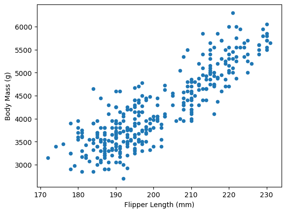
The data shows a clear linear relationship between flipper length and body mass. We use body mass as our target variable and flipper length as our feature.
X, y = data[["Flipper Length (mm)"]], data["Body Mass (g)"]
In the previous notebook, we used scikit-learn’s LinearRegression to learn model
parameters from data with fit and make predictions with predict.
from sklearn.linear_model import LinearRegression

model = LinearRegression()
model.fit(X, y)
predicted_target = model.predict(X)
ax = data.plot.scatter(x="Flipper Length (mm)", y="Body Mass (g)")
ax.plot(
    X, predicted_target, label=model.__class__.__name__, color="tab:orange", linewidth=4
)
ax.legend()
plt.show()
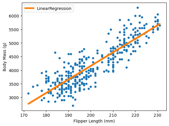
The linear regression model minimizes the error between true and predicted targets. A general term to describe this error is “loss function”. For the linear regression, from scikit-learn, it specifically minimizes the least squared error:
or equivalently:
Let’s visualize this loss function:
def se_loss(true_target, predicted_target):
    loss = (true_target - predicted_target) ** 2
    return loss
import numpy as np

xmin, xmax = -2, 2
xx = np.linspace(xmin, xmax, 100)
plt.plot(xx, se_loss(0, xx), label="SE loss")
plt.legend()
plt.show()
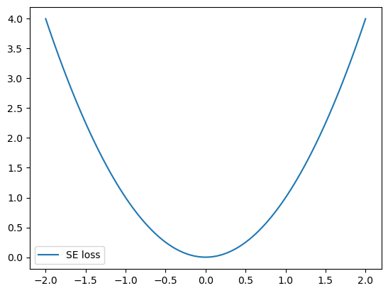
The bell shape of the loss function heavily penalizes large errors, which significantly impacts the model fit.
EXERCISE
Add an outlier to the dataset: a penguin with 230 mm flipper length and 300 g body mass
Plot the updated dataset
Fit a
LinearRegressionmodel on this dataset, usingsample_weightto give the outlier 10x more weight than other samplesPlot the model predictions
How does the outlier affect the model?
# Write your code here.
Instead of squared loss, we now use the Huber loss through scikit-learn’s
HuberRegressor. We fit this model similarly to our previous approach.
from sklearn.linear_model import HuberRegressor

sample_weight = np.ones_like(y)
sample_weight[-1] = 10
model = HuberRegressor()
model.fit(X, y, sample_weight=sample_weight)
predicted_target = model.predict(X)
# -

ax = data.plot.scatter(x="Flipper Length (mm)", y="Body Mass (g)")
ax.plot(X, predicted_target, label=model.__class__.__name__, color="black", linewidth=4)
plt.legend()
plt.show()
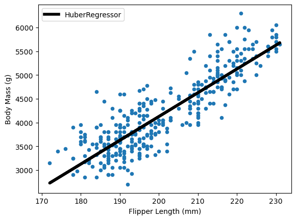
The Huber loss gives less weight to outliers compared to least squares.
EXERCISE
Read the
HuberRegressordocumentationCreate a
huber_lossfunction similar tose_lossCreate an absolute loss function
Explain why outliers affect Huber regression less than ordinary least squares.
# Write your code here.
Huber and absolute losses penalize outliers less severely. This makes outliers less
influential when finding the optimal \(\beta\) parameters. The HuberRegressor
estimates the median rather than the mean.
For other quantiles, scikit-learn offers the QuantileRegressor. It minimizes the
pinball loss to estimate specific quantiles. Here’s how to estimate the median:
from sklearn.linear_model import QuantileRegressor

model = QuantileRegressor(quantile=0.5)
model.fit(X, y, sample_weight=sample_weight)
predicted_target = model.predict(X)
ax = data.plot.scatter(x="Flipper Length (mm)", y="Body Mass (g)")
ax.plot(X, predicted_target, label=model.__class__.__name__, color="black", linewidth=4)
ax.legend()
plt.show()
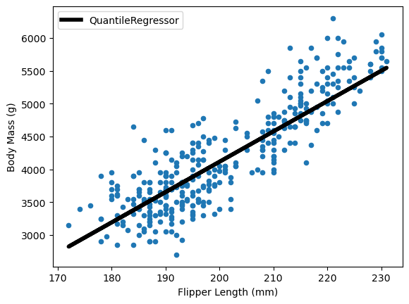
The QuantileRegressor enables estimation of confidence intervals:
model = QuantileRegressor(quantile=0.5, solver="highs")
model.fit(X, y, sample_weight=sample_weight)
predicted_target_median = model.predict(X)

model.set_params(quantile=0.90)
model.fit(X, y, sample_weight=sample_weight)
predicted_target_90 = model.predict(X)

model.set_params(quantile=0.10)
model.fit(X, y, sample_weight=sample_weight)
predicted_target_10 = model.predict(X)
ax = data.plot.scatter(x="Flipper Length (mm)", y="Body Mass (g)")
ax.plot(
    X,
    predicted_target_median,
    label=f"{model.__class__.__name__} - median",
    color="black",
    linewidth=4,
)
ax.plot(
    X,
    predicted_target_90,
    label=f"{model.__class__.__name__} - 90th percentile",
    color="tab:orange",
    linewidth=4,
)
ax.plot(
    X,
    predicted_target_10,
    label=f"{model.__class__.__name__} - 10th percentile",
    color="tab:green",
    linewidth=4,
)
ax.legend(loc="center left", bbox_to_anchor=(1, 0.5))
plt.show()
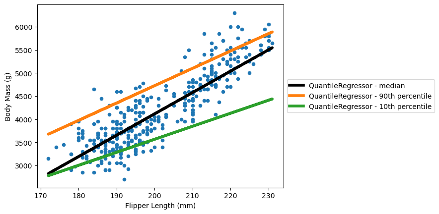
This plot shows an 80% confidence interval around the median using the 10th and 90th percentiles.