The bike rides dataset#
This notebook presents the “Bike Ride” dataset. The dataset exists in the directory
datasets in comma separated values (CSV) format.
Presentation of the dataset#
We open this dataset using pandas.
# When using JupyterLite, uncomment and install the `skrub` package.
%pip install skrub
import matplotlib.pyplot as plt
import skrub

skrub.patch_display()  # makes nice display for pandas tables
/home/runner/work/traces-sklearn/traces-sklearn/.pixi/envs/docs/bin/python: No module named pip
Note: you may need to restart the kernel to use updated packages.
import pandas as pd

cycling = pd.read_csv("../datasets/bike_rides.csv")
cycling
Processing column 1 / 7
Processing column 2 / 7
Processing column 3 / 7
Processing column 4 / 7
Processing column 5 / 7
Processing column 6 / 7
Processing column 7 / 7
| timestamp | power | heart-rate | cadence | speed | acceleration | slope | |
|---|---|---|---|---|---|---|---|
| 0 | 2020-08-18 14:43:19 | 150.0 | 102.0 | 64.0 | 4.325 | 0.088 | -0.0338696020321742 |
| 1 | 2020-08-18 14:43:20 | 161.0 | 103.0 | 64.0 | 4.336 | 0.0842 | -0.0335711288292049 |
| 2 | 2020-08-18 14:43:21 | 163.0 | 105.0 | 66.0 | 4.409 | 0.0233999999999999 | -0.0332225913621243 |
| 3 | 2020-08-18 14:43:22 | 156.0 | 106.0 | 66.0 | 4.445 | 0.0016 | -0.0329082682023839 |
| 4 | 2020-08-18 14:43:23 | 148.0 | 106.0 | 67.0 | 4.441 | 0.1143999999999999 | 0.0 |
| 38249 | 2020-09-13 14:55:57 | 0.0 | 130.0 | 0.0 | 1.054 | 0.0233999999999999 | 0.0 |
| 38250 | 2020-09-13 14:55:58 | 0.0 | 130.0 | 0.0 | 0.829 | 0.0258 | 0.0 |
| 38251 | 2020-09-13 14:55:59 | 0.0 | 129.0 | 0.0 | 0.616 | -0.1686 | 0.0 |
| 38252 | 2020-09-13 14:56:00 | 0.0 | 130.0 | 0.0 | 0.0 | -0.4284 | 0.0 |
| 38253 | 2020-09-13 14:56:01 | 0.0 | 130.0 | 0.0 | 0.0 | -0.3096 | 0.0 |
timestamp
ObjectDType- Null values
- 0 (0.0%)
- Unique values
- 38,254 (100.0%)
Most frequent values
power
Float64DType- Null values
- 0 (0.0%)
- Unique values
- 705 (1.8%)
- Mean ± Std
- 193. ± 117.
- Median ± IQR
- 199. ± 114.
- Min | Max
- 0.00 | 901.
heart-rate
Float64DType- Null values
- 0 (0.0%)
- Unique values
- 274 (0.7%)
- Mean ± Std
- 141. ± 16.6
- Median ± IQR
- 142. ± 22.0
- Min | Max
- 66.0 | 187.
cadence
Float64DType- Null values
- 0 (0.0%)
- Unique values
- 395 (1.0%)
- Mean ± Std
- 72.9 ± 25.2
- Median ± IQR
- 82.0 ± 14.0
- Min | Max
- 0.00 | 107.
speed
Float64DType- Null values
- 0 (0.0%)
- Unique values
- 10,764 (28.1%)
- Mean ± Std
- 8.20 ± 2.60
- Median ± IQR
- 8.30 ± 3.30
- Min | Max
- 0.00 | 18.6
acceleration
Float64DType- Null values
- 0 (0.0%)
- Unique values
- 11,150 (29.1%)
- Mean ± Std
- -0.00206 ± 0.226
- Median ± IQR
- 0.00580 ± 0.158
- Min | Max
- -2.38 | 1.31
slope
Float64DType- Null values
- 0 (0.0%)
- Unique values
- 16,719 (43.7%)
- Mean ± Std
- 0.00565 ± 0.108
- Median ± IQR
- 0.00 ± 0.0101
- Min | Max
- -7.73 | 14.9
No columns match the selected filter: . You can change the column filter in the dropdown menu above.
| Column | Column name | dtype | Null values | Unique values | Mean | Std | Min | Median | Max |
|---|---|---|---|---|---|---|---|---|---|
| 0 | timestamp | ObjectDType | 0 (0.0%) | 38254 (100.0%) | |||||
| 1 | power | Float64DType | 0 (0.0%) | 705 (1.8%) | 193. | 117. | 0.00 | 199. | 901. |
| 2 | heart-rate | Float64DType | 0 (0.0%) | 274 (0.7%) | 141. | 16.6 | 66.0 | 142. | 187. |
| 3 | cadence | Float64DType | 0 (0.0%) | 395 (1.0%) | 72.9 | 25.2 | 0.00 | 82.0 | 107. |
| 4 | speed | Float64DType | 0 (0.0%) | 10764 (28.1%) | 8.20 | 2.60 | 0.00 | 8.30 | 18.6 |
| 5 | acceleration | Float64DType | 0 (0.0%) | 11150 (29.1%) | -0.00206 | 0.226 | -2.38 | 0.00580 | 1.31 |
| 6 | slope | Float64DType | 0 (0.0%) | 16719 (43.7%) | 0.00565 | 0.108 | -7.73 | 0.00 | 14.9 |
No columns match the selected filter: . You can change the column filter in the dropdown menu above.
timestamp
ObjectDType- Null values
- 0 (0.0%)
- Unique values
- 38,254 (100.0%)
Most frequent values
power
Float64DType- Null values
- 0 (0.0%)
- Unique values
- 705 (1.8%)
- Mean ± Std
- 193. ± 117.
- Median ± IQR
- 199. ± 114.
- Min | Max
- 0.00 | 901.
heart-rate
Float64DType- Null values
- 0 (0.0%)
- Unique values
- 274 (0.7%)
- Mean ± Std
- 141. ± 16.6
- Median ± IQR
- 142. ± 22.0
- Min | Max
- 66.0 | 187.
cadence
Float64DType- Null values
- 0 (0.0%)
- Unique values
- 395 (1.0%)
- Mean ± Std
- 72.9 ± 25.2
- Median ± IQR
- 82.0 ± 14.0
- Min | Max
- 0.00 | 107.
speed
Float64DType- Null values
- 0 (0.0%)
- Unique values
- 10,764 (28.1%)
- Mean ± Std
- 8.20 ± 2.60
- Median ± IQR
- 8.30 ± 3.30
- Min | Max
- 0.00 | 18.6
acceleration
Float64DType- Null values
- 0 (0.0%)
- Unique values
- 11,150 (29.1%)
- Mean ± Std
- -0.00206 ± 0.226
- Median ± IQR
- 0.00580 ± 0.158
- Min | Max
- -2.38 | 1.31
slope
Float64DType- Null values
- 0 (0.0%)
- Unique values
- 16,719 (43.7%)
- Mean ± Std
- 0.00565 ± 0.108
- Median ± IQR
- 0.00 ± 0.0101
- Min | Max
- -7.73 | 14.9
No columns match the selected filter: . You can change the column filter in the dropdown menu above.
| Column 1 | Column 2 | Cramér's V |
|---|---|---|
| power | cadence | 0.337 |
| cadence | speed | 0.310 |
| power | heart-rate | 0.211 |
| cadence | acceleration | 0.190 |
| cadence | slope | 0.185 |
| power | speed | 0.183 |
| heart-rate | cadence | 0.182 |
| speed | acceleration | 0.173 |
| speed | slope | 0.168 |
| acceleration | slope | 0.159 |
| power | acceleration | 0.155 |
| heart-rate | speed | 0.128 |
| heart-rate | acceleration | 0.127 |
| heart-rate | slope | 0.103 |
| power | slope | 0.0849 |
| timestamp | cadence | 0.0837 |
| timestamp | speed | 0.0513 |
| timestamp | power | 0.0445 |
| timestamp | heart-rate | 0.0383 |
| timestamp | acceleration | 0.0233 |
Please enable javascript
The skrub table reports need javascript to display correctly. If you are displaying a report in a Jupyter notebook and you see this message, you may need to re-execute the cell or to trust the notebook (button on the top right or "File > Trust notebook").
The first column timestamp contains specific information about the time and date
of each record while other columns contain numerical measurements. Let’s check the
data types of the columns in detail.
cycling.info()
<class 'pandas.core.frame.DataFrame'>
RangeIndex: 38254 entries, 0 to 38253
Data columns (total 7 columns):
 #   Column        Non-Null Count  Dtype
---  ------        --------------  -----
 0   timestamp     38254 non-null  object
 1   power         38254 non-null  float64
 2   heart-rate    38254 non-null  float64
 3   cadence       38254 non-null  float64
 4   speed         38254 non-null  float64
 5   acceleration  38254 non-null  float64
 6   slope         38254 non-null  float64
dtypes: float64(6), object(1)
memory usage: 2.0+ MB
CSV format stores data as text. Pandas infers numerical types by default. This
explains why all features except timestamp appear as floating point values.
However, the timestamp appears as an object column. This means the data in
this column exists as str rather than a specialized datetime data type.
We need to set an option to tell pandas to infer this data type when opening
the file. Additionally, we want to use timestamp as an index. We reopen the
file with extra arguments to help pandas read our CSV file properly.
cycling = pd.read_csv(
    "../datasets/bike_rides.csv", index_col=0, parse_dates=True
)
cycling.index.name = ""
cycling
Processing column 1 / 6
Processing column 2 / 6
Processing column 3 / 6
Processing column 4 / 6
Processing column 5 / 6
Processing column 6 / 6
| power | heart-rate | cadence | speed | acceleration | slope | |
|---|---|---|---|---|---|---|
| 2020-08-18 14:43:19 | 150.0 | 102.0 | 64.0 | 4.325 | 0.088 | -0.0338696020321742 |
| 2020-08-18 14:43:20 | 161.0 | 103.0 | 64.0 | 4.336 | 0.0842 | -0.0335711288292049 |
| 2020-08-18 14:43:21 | 163.0 | 105.0 | 66.0 | 4.409 | 0.0233999999999999 | -0.0332225913621243 |
| 2020-08-18 14:43:22 | 156.0 | 106.0 | 66.0 | 4.445 | 0.0016 | -0.0329082682023839 |
| 2020-08-18 14:43:23 | 148.0 | 106.0 | 67.0 | 4.441 | 0.1143999999999999 | 0.0 |
| 2020-09-13 14:55:57 | 0.0 | 130.0 | 0.0 | 1.054 | 0.0233999999999999 | 0.0 |
| 2020-09-13 14:55:58 | 0.0 | 130.0 | 0.0 | 0.829 | 0.0258 | 0.0 |
| 2020-09-13 14:55:59 | 0.0 | 129.0 | 0.0 | 0.616 | -0.1686 | 0.0 |
| 2020-09-13 14:56:00 | 0.0 | 130.0 | 0.0 | 0.0 | -0.4284 | 0.0 |
| 2020-09-13 14:56:01 | 0.0 | 130.0 | 0.0 | 0.0 | -0.3096 | 0.0 |
power
Float64DType- Null values
- 0 (0.0%)
- Unique values
- 705 (1.8%)
- Mean ± Std
- 193. ± 117.
- Median ± IQR
- 199. ± 114.
- Min | Max
- 0.00 | 901.
heart-rate
Float64DType- Null values
- 0 (0.0%)
- Unique values
- 274 (0.7%)
- Mean ± Std
- 141. ± 16.6
- Median ± IQR
- 142. ± 22.0
- Min | Max
- 66.0 | 187.
cadence
Float64DType- Null values
- 0 (0.0%)
- Unique values
- 395 (1.0%)
- Mean ± Std
- 72.9 ± 25.2
- Median ± IQR
- 82.0 ± 14.0
- Min | Max
- 0.00 | 107.
speed
Float64DType- Null values
- 0 (0.0%)
- Unique values
- 10,764 (28.1%)
- Mean ± Std
- 8.20 ± 2.60
- Median ± IQR
- 8.30 ± 3.30
- Min | Max
- 0.00 | 18.6
acceleration
Float64DType- Null values
- 0 (0.0%)
- Unique values
- 11,150 (29.1%)
- Mean ± Std
- -0.00206 ± 0.226
- Median ± IQR
- 0.00580 ± 0.158
- Min | Max
- -2.38 | 1.31
slope
Float64DType- Null values
- 0 (0.0%)
- Unique values
- 16,719 (43.7%)
- Mean ± Std
- 0.00565 ± 0.108
- Median ± IQR
- 0.00 ± 0.0101
- Min | Max
- -7.73 | 14.9
No columns match the selected filter: . You can change the column filter in the dropdown menu above.
| Column | Column name | dtype | Null values | Unique values | Mean | Std | Min | Median | Max |
|---|---|---|---|---|---|---|---|---|---|
| 0 | power | Float64DType | 0 (0.0%) | 705 (1.8%) | 193. | 117. | 0.00 | 199. | 901. |
| 1 | heart-rate | Float64DType | 0 (0.0%) | 274 (0.7%) | 141. | 16.6 | 66.0 | 142. | 187. |
| 2 | cadence | Float64DType | 0 (0.0%) | 395 (1.0%) | 72.9 | 25.2 | 0.00 | 82.0 | 107. |
| 3 | speed | Float64DType | 0 (0.0%) | 10764 (28.1%) | 8.20 | 2.60 | 0.00 | 8.30 | 18.6 |
| 4 | acceleration | Float64DType | 0 (0.0%) | 11150 (29.1%) | -0.00206 | 0.226 | -2.38 | 0.00580 | 1.31 |
| 5 | slope | Float64DType | 0 (0.0%) | 16719 (43.7%) | 0.00565 | 0.108 | -7.73 | 0.00 | 14.9 |
No columns match the selected filter: . You can change the column filter in the dropdown menu above.
power
Float64DType- Null values
- 0 (0.0%)
- Unique values
- 705 (1.8%)
- Mean ± Std
- 193. ± 117.
- Median ± IQR
- 199. ± 114.
- Min | Max
- 0.00 | 901.
heart-rate
Float64DType- Null values
- 0 (0.0%)
- Unique values
- 274 (0.7%)
- Mean ± Std
- 141. ± 16.6
- Median ± IQR
- 142. ± 22.0
- Min | Max
- 66.0 | 187.
cadence
Float64DType- Null values
- 0 (0.0%)
- Unique values
- 395 (1.0%)
- Mean ± Std
- 72.9 ± 25.2
- Median ± IQR
- 82.0 ± 14.0
- Min | Max
- 0.00 | 107.
speed
Float64DType- Null values
- 0 (0.0%)
- Unique values
- 10,764 (28.1%)
- Mean ± Std
- 8.20 ± 2.60
- Median ± IQR
- 8.30 ± 3.30
- Min | Max
- 0.00 | 18.6
acceleration
Float64DType- Null values
- 0 (0.0%)
- Unique values
- 11,150 (29.1%)
- Mean ± Std
- -0.00206 ± 0.226
- Median ± IQR
- 0.00580 ± 0.158
- Min | Max
- -2.38 | 1.31
slope
Float64DType- Null values
- 0 (0.0%)
- Unique values
- 16,719 (43.7%)
- Mean ± Std
- 0.00565 ± 0.108
- Median ± IQR
- 0.00 ± 0.0101
- Min | Max
- -7.73 | 14.9
No columns match the selected filter: . You can change the column filter in the dropdown menu above.
| Column 1 | Column 2 | Cramér's V |
|---|---|---|
| power | cadence | 0.323 |
| cadence | speed | 0.297 |
| power | heart-rate | 0.215 |
| speed | acceleration | 0.203 |
| power | acceleration | 0.195 |
| cadence | acceleration | 0.188 |
| heart-rate | cadence | 0.178 |
| power | speed | 0.173 |
| speed | slope | 0.139 |
| heart-rate | speed | 0.125 |
| heart-rate | acceleration | 0.123 |
| cadence | slope | 0.0577 |
| heart-rate | slope | 0.0435 |
| power | slope | 0.0381 |
| acceleration | slope | 0.0123 |
Please enable javascript
The skrub table reports need javascript to display correctly. If you are displaying a report in a Jupyter notebook and you see this message, you may need to re-execute the cell or to trust the notebook (button on the top right or "File > Trust notebook").
cycling.info()
<class 'pandas.core.frame.DataFrame'>
DatetimeIndex: 38254 entries, 2020-08-18 14:43:19 to 2020-09-13 14:56:01
Data columns (total 6 columns):
 #   Column        Non-Null Count  Dtype
---  ------        --------------  -----
 0   power         38254 non-null  float64
 1   heart-rate    38254 non-null  float64
 2   cadence       38254 non-null  float64
 3   speed         38254 non-null  float64
 4   acceleration  38254 non-null  float64
 5   slope         38254 non-null  float64
dtypes: float64(6)
memory usage: 2.0 MB
By telling pandas to parse the date, we get a DatetimeIndex that helps filter
data based on date.
Let’s examine the data stored in our dataframe. This helps us frame the data science problem we aim to solve.
The records include information from GPS recordings of a cyclist (speed,
acceleration, slope) and extra information from other sensors: heart-rate
shows the number of heart beats per minute, cadence indicates how fast the
cyclist turns the pedals, and power measures the work required to move forward.
To explain power more intuitively:
Consider a soup blender used to blend vegetables. The blender’s engine develops ~300 Watts of instantaneous power. Here, our cyclist acts as the engine (though an average cyclist develops ~150 Watts) and moving forward replaces blending vegetables.
Professional cyclists use power to calibrate their training and track energy expenditure during rides. Higher power requires more energy, which demands more resources to create this energy. Humans use food as their resource. A soup blender might use uranium, petrol, natural gas, or coal. Our body works as a power plant to transform resources into energy.
The challenge with measuring power relates to sensor cost: a cycling power meter costs between \(400 and \)1000. This leads to our data science problem: predict instantaneous cyclist power using other (cheaper) sensors.
target_name = "power"
data, target = cycling.drop(columns=target_name), cycling[target_name]
Let’s examine the target distribution first.
_, ax = plt.subplots()
target.plot.hist(bins=50, edgecolor="black", ax=ax)
ax.set_xlabel("Power (W)")
plt.show()
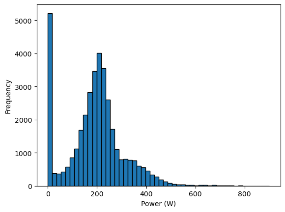
We see a peak at 0 Watts, representing moments when the cyclist stops pedaling (during descents or stops). On average, this cyclist delivers ~200 Watts. A long tail extends from ~300 Watts to ~400 Watts. This range represents efforts a cyclist trains to reproduce for breakaways in the final kilometers of a race. However, the human body finds it costly to maintain this power output.
Let’s examine the data.
data
Processing column 1 / 5
Processing column 2 / 5
Processing column 3 / 5
Processing column 4 / 5
Processing column 5 / 5
| heart-rate | cadence | speed | acceleration | slope | |
|---|---|---|---|---|---|
| 2020-08-18 14:43:19 | 102.0 | 64.0 | 4.325 | 0.088 | -0.0338696020321742 |
| 2020-08-18 14:43:20 | 103.0 | 64.0 | 4.336 | 0.0842 | -0.0335711288292049 |
| 2020-08-18 14:43:21 | 105.0 | 66.0 | 4.409 | 0.0233999999999999 | -0.0332225913621243 |
| 2020-08-18 14:43:22 | 106.0 | 66.0 | 4.445 | 0.0016 | -0.0329082682023839 |
| 2020-08-18 14:43:23 | 106.0 | 67.0 | 4.441 | 0.1143999999999999 | 0.0 |
| 2020-09-13 14:55:57 | 130.0 | 0.0 | 1.054 | 0.0233999999999999 | 0.0 |
| 2020-09-13 14:55:58 | 130.0 | 0.0 | 0.829 | 0.0258 | 0.0 |
| 2020-09-13 14:55:59 | 129.0 | 0.0 | 0.616 | -0.1686 | 0.0 |
| 2020-09-13 14:56:00 | 130.0 | 0.0 | 0.0 | -0.4284 | 0.0 |
| 2020-09-13 14:56:01 | 130.0 | 0.0 | 0.0 | -0.3096 | 0.0 |
heart-rate
Float64DType- Null values
- 0 (0.0%)
- Unique values
- 274 (0.7%)
- Mean ± Std
- 141. ± 16.6
- Median ± IQR
- 142. ± 22.0
- Min | Max
- 66.0 | 187.
cadence
Float64DType- Null values
- 0 (0.0%)
- Unique values
- 395 (1.0%)
- Mean ± Std
- 72.9 ± 25.2
- Median ± IQR
- 82.0 ± 14.0
- Min | Max
- 0.00 | 107.
speed
Float64DType- Null values
- 0 (0.0%)
- Unique values
- 10,764 (28.1%)
- Mean ± Std
- 8.20 ± 2.60
- Median ± IQR
- 8.30 ± 3.30
- Min | Max
- 0.00 | 18.6
acceleration
Float64DType- Null values
- 0 (0.0%)
- Unique values
- 11,150 (29.1%)
- Mean ± Std
- -0.00206 ± 0.226
- Median ± IQR
- 0.00580 ± 0.158
- Min | Max
- -2.38 | 1.31
slope
Float64DType- Null values
- 0 (0.0%)
- Unique values
- 16,719 (43.7%)
- Mean ± Std
- 0.00565 ± 0.108
- Median ± IQR
- 0.00 ± 0.0101
- Min | Max
- -7.73 | 14.9
No columns match the selected filter: . You can change the column filter in the dropdown menu above.
| Column | Column name | dtype | Null values | Unique values | Mean | Std | Min | Median | Max |
|---|---|---|---|---|---|---|---|---|---|
| 0 | heart-rate | Float64DType | 0 (0.0%) | 274 (0.7%) | 141. | 16.6 | 66.0 | 142. | 187. |
| 1 | cadence | Float64DType | 0 (0.0%) | 395 (1.0%) | 72.9 | 25.2 | 0.00 | 82.0 | 107. |
| 2 | speed | Float64DType | 0 (0.0%) | 10764 (28.1%) | 8.20 | 2.60 | 0.00 | 8.30 | 18.6 |
| 3 | acceleration | Float64DType | 0 (0.0%) | 11150 (29.1%) | -0.00206 | 0.226 | -2.38 | 0.00580 | 1.31 |
| 4 | slope | Float64DType | 0 (0.0%) | 16719 (43.7%) | 0.00565 | 0.108 | -7.73 | 0.00 | 14.9 |
No columns match the selected filter: . You can change the column filter in the dropdown menu above.
heart-rate
Float64DType- Null values
- 0 (0.0%)
- Unique values
- 274 (0.7%)
- Mean ± Std
- 141. ± 16.6
- Median ± IQR
- 142. ± 22.0
- Min | Max
- 66.0 | 187.
cadence
Float64DType- Null values
- 0 (0.0%)
- Unique values
- 395 (1.0%)
- Mean ± Std
- 72.9 ± 25.2
- Median ± IQR
- 82.0 ± 14.0
- Min | Max
- 0.00 | 107.
speed
Float64DType- Null values
- 0 (0.0%)
- Unique values
- 10,764 (28.1%)
- Mean ± Std
- 8.20 ± 2.60
- Median ± IQR
- 8.30 ± 3.30
- Min | Max
- 0.00 | 18.6
acceleration
Float64DType- Null values
- 0 (0.0%)
- Unique values
- 11,150 (29.1%)
- Mean ± Std
- -0.00206 ± 0.226
- Median ± IQR
- 0.00580 ± 0.158
- Min | Max
- -2.38 | 1.31
slope
Float64DType- Null values
- 0 (0.0%)
- Unique values
- 16,719 (43.7%)
- Mean ± Std
- 0.00565 ± 0.108
- Median ± IQR
- 0.00 ± 0.0101
- Min | Max
- -7.73 | 14.9
No columns match the selected filter: . You can change the column filter in the dropdown menu above.
| Column 1 | Column 2 | Cramér's V |
|---|---|---|
| cadence | speed | 0.317 |
| speed | slope | 0.282 |
| cadence | slope | 0.218 |
| speed | acceleration | 0.212 |
| cadence | acceleration | 0.205 |
| heart-rate | cadence | 0.181 |
| acceleration | slope | 0.125 |
| heart-rate | slope | 0.124 |
| heart-rate | speed | 0.117 |
| heart-rate | acceleration | 0.0982 |
Please enable javascript
The skrub table reports need javascript to display correctly. If you are displaying a report in a Jupyter notebook and you see this message, you may need to re-execute the cell or to trust the notebook (button on the top right or "File > Trust notebook").
First, let’s look closely at the dataframe index.
data.index
DatetimeIndex(['2020-08-18 14:43:19', '2020-08-18 14:43:20',
               '2020-08-18 14:43:21', '2020-08-18 14:43:22',
               '2020-08-18 14:43:23', '2020-08-18 14:43:24',
               '2020-08-18 14:43:25', '2020-08-18 14:43:26',
               '2020-08-18 14:43:27', '2020-08-18 14:43:28',
               ...
               '2020-09-13 14:55:52', '2020-09-13 14:55:53',
               '2020-09-13 14:55:54', '2020-09-13 14:55:55',
               '2020-09-13 14:55:56', '2020-09-13 14:55:57',
               '2020-09-13 14:55:58', '2020-09-13 14:55:59',
               '2020-09-13 14:56:00', '2020-09-13 14:56:01'],
              dtype='datetime64[ns]', name='', length=38254, freq=None)
The records occur every second.
data.index.min(), data.index.max()
(Timestamp('2020-08-18 14:43:19'), Timestamp('2020-09-13 14:56:01'))
The data spans from August 18, 2020 to September 13, 2020. Obviously, our cyclist did not ride every second between these dates. Only a few dates should appear in the dataframe, matching the number of cycling rides.
data.index.normalize().nunique()
4
Four different dates correspond to four rides. Let’s extract only the first ride from August 18, 2020.
date_first_ride = "2020-08-18"
cycling_ride = cycling.loc[date_first_ride]
data_ride, target_ride = data.loc[date_first_ride], target.loc[date_first_ride]
_, ax = plt.subplots()
data_ride.plot(ax=ax)
ax.legend(bbox_to_anchor=(1.05, 1), loc="upper left")
ax.set_title("Sensor values for different cyclist measurements")
plt.show()
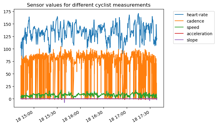
Different units and ranges for each measurement (feature) make the plot hard to interpret. Also, high temporal resolution obscures observations. Let’s resample the data for a smoother visualization.
data_ride.resample("60s").mean().plot()
ax.legend(bbox_to_anchor=(1.05, 1), loc="upper left")
ax.set_title("Sensor values for different cyclist measurements")
plt.show()
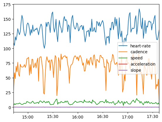
Let’s check the range of different features:
axs = data_ride.hist(figsize=(10, 12), bins=50, edgecolor="black", grid=False)
# add the units to the plots
units = [
    "beats per minute",
    "rotations per minute",
    "meters per second",
    "meters per second squared",
    "%",
]
for unit, ax in zip(units, axs.ravel()):
    ax.set_xlabel(unit)
plt.subplots_adjust(hspace=0.6)
plt.show()
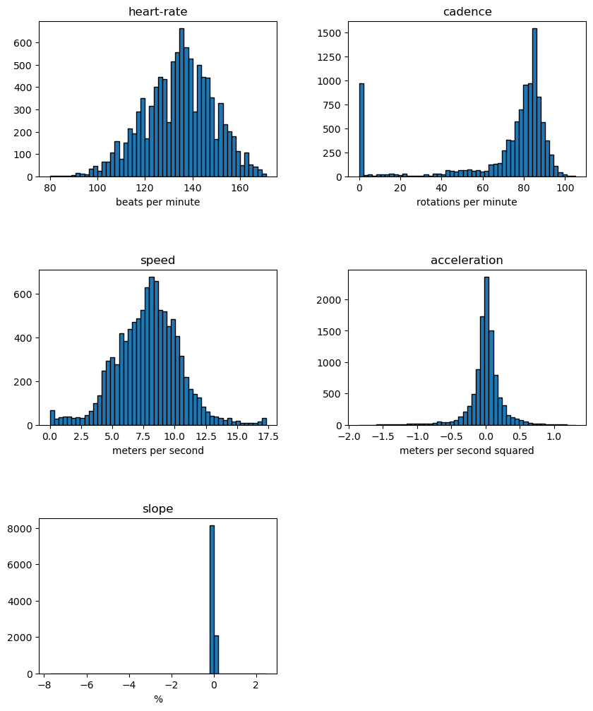
These plots reveal interesting information: a cyclist spends time without pedaling. These samples correspond to null power. The slope also shows large extremes.
Let’s create a pair plot on a subset of data samples to confirm these insights.
import numpy as np

rng = np.random.default_rng(0)
indices = rng.choice(np.arange(cycling_ride.shape[0]), size=500, replace=False)
subset = cycling_ride.iloc[indices].copy()
# Quantize the target and keep the midpoint for each interval
subset["power"] = pd.qcut(subset["power"], 6, retbins=False)
subset["power"] = subset["power"].apply(lambda x: x.mid)
# install seaborn when you are using JupyterLite
%pip install seaborn
import seaborn as sns

sns.pairplot(data=subset, hue="power", palette="viridis")
plt.show()
/home/runner/work/traces-sklearn/traces-sklearn/.pixi/envs/docs/bin/python: No module named pip
Note: you may need to restart the kernel to use updated packages.
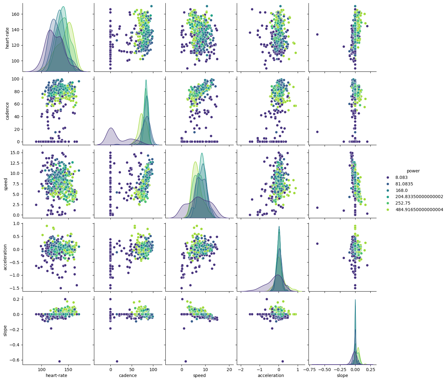
Low cadence correlates with low power. Higher slopes and heart-rates link to higher power: a cyclist needs more energy to climb hills, which demands more from the body. The interaction between slope and speed confirms this: lower speed with higher slope typically means higher power.
Data science challenge#
This challenge asks you to predict cyclist power from other sensor measurements.
Go beyond the baseline model! Here are some ideas:
Use physical models of the bike and cyclist to predict power (e.g. use velocity and slope to predict power needed for climbing).
Try a black-box approach.
Predict confidence intervals.
Analyze sensor influence (i.e. feature importance).
Evaluate your models using cross-validation.
And more!